Often when you go to a financial planner to plan your retirement, they will give you a graph to show how your capital might fare over a period.
The process is fairly simple. You start with an amount of capital, it earns interest, dividends and growth over time, and this grows the amount of capital. Deduct the amount you draw to live on, and you are left with a balance. Then, draw a graph of the balance each year, and there is your future capital mapped out.
However, this comes with at least 2 serious drawbacks.
First, it involves some very brave assumptions about future earning rates, and history shows us that earning rates can fluctuate widely over periods extending over decades. For substantial chunks of the projection period, it is almost certain to be wrong.
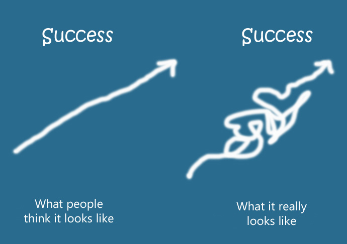
Second, the result will be a smooth curve (up or down), or a straight line. But, this is not how it works.
In order get a better grasp of reality, I worked with a researcher who built models that go back to the late 1960’s up until the current time. We can use the models to see how account values would have actually looked.
The answers were sobering.
The end values differed massively, by over 10 times, depending when you started, and the graphs showing account values over time were anything but smooth or straight. Sometimes capital ran out after 15 years, and other times it was more than eight times the starting value after 25 years.
Now its confession time. I too used to draw the smooth curves, but no more. Now I know better, and smooth curves are way different from reality.
